Monday 14 November 2016

5 mistakes you're making when painting comma strokes and how to fix them


When we meet our customers at shows or at our Ambassador courses, they will often say that they love to complete our dotty designs made popular by our Starter kits and Dotty collection but that they just can't get the hang of comma strokes.  For many, it seems like a huge leap of faith to suddenly swap your dotting tool for a paintbrush and it can be easy to become disheartened with your progress if we don't get it right first time.  Sound familiar? 

The thing is, not everyone will experience these 5 issues, some may only be missing one of them but each factor can make the difference between a wonky comma stroke and the brush stroke you've always dreamed about painting.  The great news is that each one of them is a minor thing and we see them time and time again but we also see that with awareness, practice and perseverance, these issues can be overcome and anyone can create the perfect comma stroke.  

So, what are you doing that is throwing your brushstrokes off track? 

When we are painting, it is easy to become so focused on the act of painting that we don't consider the fact that we might be doing something differently to what we have seen others do.  The next time you sit to paint a design from one of our Series 1 add on kits, we would like you to become aware of these issues and, if you see that these are something you do, work on improving them.  

1. Thinking too much


Well of course we need to concentrate, we are learning a new skill! Right? To a point.... Yes, we need to think about how we are sitting, where our paintbrush is pointing but once we have mastered those, we should let the brush do the work rather than our minds.  So often we become so hung up on creating the perfect curve, the neatest point, that we try to control the direction our brush is going and flick the bristles or pull the brush away too quickly from our paper.  

We will let you into a little secret here..... if you position your brush on the paper correctly and move your brush slowly, you will find you get a much smoother stroke.  It does not matter if each practice stroke is not perfect, what matters is that you sit back, relax and enjoy the process.  The funny thing is that once your paintbrush knows you're more relaxed it will work with you instead of fighting against you! 

2. Loading your brush with too much or too little paint.  


When you load your brush with too much paint, you will find that as you paint your comma stroke, the comma will not be flat but will have two ridges of paint on each edge of the stroke.  If you do not load your brush with enough paint, no matter how you move your brush to create the point, your brushstroke will fade away and disappear before you can finish it.  

To see how to load the correct amount of paint onto your brush, take a look at this video (you will have a similar demonstration on your DVD included with the add on kit you've bought). 


3. Holding your brush too flat. 

When we are striving for the perfect brushstroke, we want to get it right and it's easy to think that if we hold our brush flat meaning the handle is close to our practice paper, then it will help us to control the brush more when in fact it often makes it harder to use. 

To overcome this, you need to forget about the brushstrokes and the outcome and perfect the way you hold the brush. To help you paint the best comma stroke, sit upright and hold your brush in the hand you feel most comfortable using (Right handed people are no more successful at Folk Art painting than left handed people, everyone is on an equal footing when they first begin painting).  Without using any paint to begin with, simply place your brush on the paper and point the top of the handle towards your shoulder.  For example, if you are left handed, the handle should point slightly towards your left shoulder.  This means that your brush should be almost upright rather than pointing to a wall.  If you are right handed, your paintbrush should be pointing up and tilted towards your right shoulder.    

4. Holding your brush too high up. 

For many of us, when we have painted in the past, as a child or later on, no one has shown us how to hold a brush as there isn't necessarily a correct way to do so.  If you find that your brushstrokes are not coming out the way you would like them to, check where you are holding it.  If you grip your brush higher up on the wooden area, you are not alone and you need to reposition your grip now.  

To correct this mistake, you need to think of your brush almost like a pencil.  You should be holding your paintbrush close to the ferrule - the metal area of your brush.  Holding it here still allows you to see your comma strokes as you create them yet it gives you much more control when you are painting.  

5. Not putting enough pressure on your brush.  

It can be so easy to be scared of putting pressure on your brush when creating this lovely brushstroke and many new folkers tend to put just enough pressure on their brush for the bristles to touch the paper.  Doing this has a tendency to create thin, wobbly brushstrokes.  

To help you paint a confident, rounded comma stroke, as you hold your brush pointing towards your shoulder, press your brush towards the paper so that the bristles lay almost flat on the paper (but do not allow the metal ferrule to touch the paper) you will see the bristles spreading out slightly as you do (this helps to create the nice rounded shape at the top of the comma stroke).   Once you have added this pressure, to complete the stroke, slowly drag your brush and lift at the same time.  It is the process of removing this pressure and lifting the bristles away from the paper that helps to create the point at the end. 


It may seem daunting to try to tackle these issues but just as when you learn anything new, it will get easier and with enough practice, it will become automatic.  As you practice, you are teaching your body how to carry out these actions, building muscle memory until eventually, your body and hands will help you create confident brush strokes without you having to consciously think about it.  Whether you have already perfected this skill or have some way to go, the fun is in practicing.   For us, completed projects are wonderful but nothing can beat sitting down and just painting and not worrying about the outcome.  

Happy Folking! 


SHARE:

Friday 23 September 2016

Go dotty for our brand new kits!

You Can Folk It Dotty Collection

 We've all been there haven't we? That place when you see something creative and automatically think to yourself, 'There's no way I could do that. I'm not artistic"  Some projects, some crafts seem so complex we think we would never be able to master them.  

Just as Kandinsky once said, “Everything starts from a dot” our gorgeous new collection of painting kits do just that.  Using nothing more than a dotting tool and dots of paint, each kit gives you everything you need to create not one but 6 gorgeous designs. 

Step by step, we want to help others re-discover the joy of creating.  Watch something beautiful emerge from a series of dots as you forget your worries and enjoy relaxing as you learn to paint.

What you get in each kit...

3 1oz bottles of Acrylic paint 
6 designs/pattern sheets to trace (there is no freehand drawing involved!) 
Full Colour, step by step instruction booklet 
A link to an Online lesson 
6 colour mount shapes - perfect for turning into gift tags, personalising books and journals or decorating gift bags. 
Transfer paper 
Dotting tool 

We passionately believe everyone should have to opportunity to create beautiful things. So whether you prefer the beautiful Sweetheart designs, classic wreath patterns or festive baubles, there is a kit for everyone.   Even if you believe you can’t paint, you can! 


Welcome to the first step on your creative journey. Take time out from your day to have fun and dot it! 

Start with one dot and see where the dots will lead, after all, it’s about the

journey, not the destination.

Happy Painting
The You Can Folk It! Team x
SHARE:

Wednesday 24 August 2016

Create the perfect crackle finish every time with DecoArt's Weathered Wood.


At You Can Folk It HQ, we love creating new projects and playing with different mediums and products to create different surfaces to add our Folk Art designs on to. One product we have been loving lately is DecoArt's Weathered wood. This fantastic liquid can help us turn any plain surface into one with texture and detail by causing your paint to crack and split.   Following our journal makeover, we have had so many questions about using weathered wood, we thought we would let you know how to use it well to create the best finish for each and every one of your future projects. 

Use DecoArt's weathered wood medium between two different colours/layers of paint to create cracks in your paint. This gives any project a vintage, aged look.

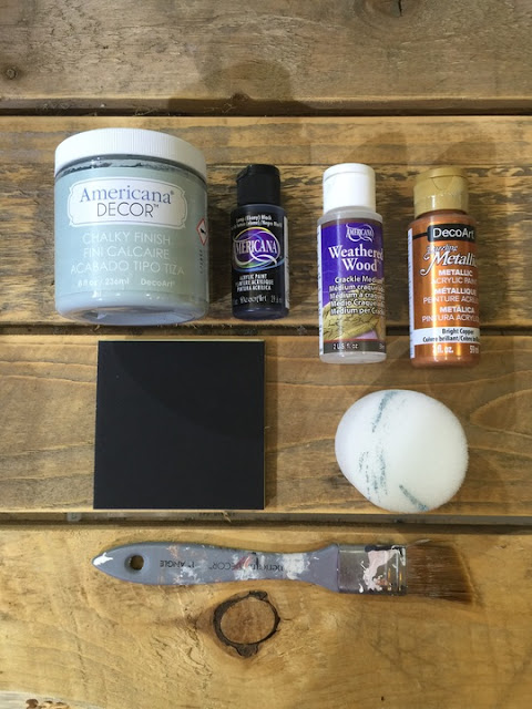
For this project, you will need: 

2 different colours of Decoart Americana or Chalky Finish Paints 
Base coating brush sponge 
Mount board for practice - this is great as it won't warp and we can add any practice boards we don't use for a project to our painting journal.


DecoArt weathered wood is known as a 'sandwich crackle' because it has to be sandwiched between 2 layers of paint to work. How you apply the top layer of paint determines how the crackle will appear, so it's always a good idea to try out variations before starting a project.

Here you can see some of the different effects you can create:

By applying the paint using a sponge or a brush, DecoArt Weathered wood creates different cracks on the surface of your project.

Depending on the look you wish to create, you can apply a dark colour on the base and a lighter colour on top or vice versa.  If you are using DecoArt Americana Acrylic or chalky finish paint for both layers, they can be used in any order you wish.  However, when you are using Dazzling Metallics, as we have done (see mount board No 4) metallics do not crackle. For this reason they can only be used as the base coat, not the top coat.

So now you have chosen your colours, let's begin.

Step 1. Basecoat your board and leave to dry. As always, you can leave your paint to dry naturally or speed the process up with a good old hairdryer.

Step 2. Apply a layer of the crackle medium and allow to dry naturally. This normally takes around 30 minutes.You'll know it's ready for the next step when your fingers don't stick to the surface.

Step 3 - Apply your top coat.  Feel free to mix a custom colour for your top coat but never water down your paint as this will affect the medium and prevent it from working as well. Once you've got your topcoat ready, this is where the magic happens! Two factors contribute to the crackle pattern you end up with; what you apply the top coat with and how thick you apply the top coat.

Applying paint with a sponge - dabbing the top coat onto the crackle medium. The trick to this method is to always work in a methodical way. Don't go back over the area you've already added paint to as this will remove the paint you've just applied.  On mount boards 1 & 3 above, you will see this method creates a lovely spidery pattern which is often finer than when you apply it with a brush.

Next, create some test samples using a brush to apply the top coat. When applying the paint lay the paint down gently, don't apply any pressure to the brush - you need to aim for a nice solid covering in one coat.

Again, once you've laid the paint down, don't go back over it, otherwise you will remove the paint. The main reason for this is that the top coat activates the weathered wood and it turns to a jelly like substance that is easily disturbed.

When applying the paint with a brush, the direction in which you apply the paint with a brush is the direction in which the cracks will form. Looking at examples 2 & 4 above, you can see that the paint has been applied with a brush using vertical strokes.  Had the paint been applied from left to right, the result would have been horizontal cracks.   

When painting circular or cylindrical items, apply DecoArt's weathered wood with a sponge. Creating vertical or horizontal lines would look severe and distract the eye from its shape.


The direction becomes important when you are considering the finished look of your project.   For a circular project for example, applying the paint with a sponge is the best option. As you can see from the enamel bucket we painted (above), the spidery cracks give it a beautiful finish. Creating lines of crackle would have distracted from the shape. However, when painting a wardrobe for example, by applying the top coat vertically, the cracks begin to enhance the shape of each panel you apply it to. 


Applying the top coat of paint in varying thicknesses will change the size of the cracks that form on your project.  Thicker paint will create larger cracks and a thin layer of paint will create finer cracks.  Never water down your paint or change the consistency in any way.

There are so many ways you can use crackle and there are so many factors that change the appearance of the finished look. Play with different colours and investigate whether you prefer light colours underneath or deeper shades as the base coat.   Why not try applying with a brush in a cross hatch motion which will give you a different effect once again. The great thing is with this medium is that you do not need to apply the medium all over the object or surface.  It's fun to just apply patches of weathered wood to the base or vary the thickness of the topcoat to change the size of the cracks you wish to form (as the love heart above shows).  

Change or update the look of any item with DecoArt Weathered Wood medium. We love the crackled, aged effect it creates.

Once we were happy with our crackled items, we used DecoArt Metallic Lustres to add stencils to some of them and also dry brushed the lustre around any raised areas/edges to give each one a bit of sparkle.  Whether you wish to leave them plain, stencil them or add a bit of Folky detail on your projects, each one will look nothing less than beautiful. 

Happy Folking, 

The You Can Folk It team xx


SaveSaveSaveSave
SHARE:

Monday 13 June 2016

How to create a Father's Day card that they will love


With Father's Day coming around, many of us are thinking about what to buy, create or bake that will express our thanks for being there for us. It's true there are many shops and websites out there offering great ideas but there's nothing better than creating your own cards, gifts or even gift wrap. 
Here are a few ideas to help you create a gorgeous Fathers Day card with You Can Folk It...

What you'll need: 
Any of the Series 1 add on kits - these teach you the all important comma stroke. 
Our Chef, moustache and guitar patterns


1. Dot Rose card 
With any of our designs, you can create so many different looks just by changing the paint colours you use. Here, we used the dot rose heart from our Series 1 Starter kit. Instead of using the colours from the original design, we created the heart using Lamp black and Warm white from the kit to give the design a more masculine look. 

One of the fantastic things about Folk Art is that it is not the design that is important but the brushstroke. Once you have mastered the comma stroke from our Series 1 add on kits, you can use it to create anything you wish; from roses to angels, daisies to beautiful borders. 

However, this versatile brushstroke can create so much more! Here at Folky HQ, our resident designer Sandra has been working her magic to create a few other designs. 


2. The Chef card 
Still limiting the colour palette to Lamp Black and Warm White, base coat your chef in White using the round brush. To achieve a smooth finish, use comma strokes to fill the area in.  Let it dry and if needed very lightly sand smooth.  Continue this process until you have applied three coats.  Using the liner brush and the Lamp Black, paint comma strokes  to create his moustache.  Using your dotting tool, add dots for his buttons.

3.  Moustaches 

Using the Lamp Black and your round brush, paint the areas with comma strokes. If your brushstrokes do not give you the shape you want, especially if you find it difficult to create the curled moustache, simply fill in the shape using your brush. 


4. Guitar - For all those musical or music obsessed Dad's out there :) 

Base coat the guitar in Lamp Black with the round brush, let dry and lightly sand. With the liner brush, paint the stems in Lamp Black.  Add black dots with the large end of the dotting tool. A good tip here is to make sure the dots are dry so your work doesn't get smudged as you continue to paint the rest of the design. If you wish to move on with the design, simply use a hairdryer to speed up the process.  Next, with the small end of the dotting tool, add comma strokes for the leaves in Warm White. 

For the detail on the guitar apply the top heart in Warm White with the small end of the dotting tool. Next, apply the white circle with the large end of the dotting tool. For the middle heart, use the large end of the dotting tool and the last one at the bottom with the small end of the dotting tool.  When these are dry, add more hearts over the top of the white using Lamp black and the small end of the dotting tool.  To finish, using the liner brush, paint stems close to the edge of the guitar in Warm White and with the small end of the dotting tool apply tiny leaves in the same colour.  Once dry scatter white and black dots around the stems.

DON"T FORGET THE DETAILS! 

When you have created your card, it is easy to get so caught up in the satisfaction of your make that the envelopes get overlooked. To complete your handprinted creation, why not add designs to the back of the envelope as we have done here or add a small design to the corner of the front of your envelope? 

What will you be creating for Father's Day? We hope we have inspired you and as always, if you do create one of these cards, or something different using our kits, we would love to see it. 

Happy Folking, 

You Can Folk It! 

SaveSave
SHARE:

Monday 6 June 2016

How to create unique storage that everyone will admire


What you will need: 

Vintage suitcase (or similar)  


This month, we were featured in the fantastic Reloved magazine. If you haven't come across this publication, it is the go to magazine for the latest up-cycling inspiration. Since it went on sale, we have had so many enquiries about out gorgeous dragonfly and rosebuds up-cycled suitcase, we have put together this step-by-step how to for you to follow. 


1. As with our Vintage Rose and Oriental Blossom cases, begin by painting the whole case (inc. the metal details and handle) in DecoArt Chalky Finish paint (this time in Vintage)


2. Next, use a brush and apply DecoArt Metallic Lustre in Iced Espresso to the details (corners, locks handles etc) The reason for this is to give the wax something to adhere to. Leave the wax to dry completely. Once it is dry, buff with a dry, lint free cloth to give you the fantastic metallic look.


3. Next, copy your chosen designs using a Laserjet printer. Laser printed images do give the best results.  It is possible to use an ink jet printer but the ink may smudge as you seal the image. When you are ready, follow Carol's instructions on our Series 2 DVD's to help you prepare your surface and transfer the images. The stamps, dragonfly, hotel images as well as the ones we transferred on to the sides are all from our Series 2 Design book and have already been reversed for you.


4.  Once you have transferred the images, paint rosebuds from our Series 2 design around the 'Hotel Royal' transfer. There is no right or wrong way to do this; you can copy the design Carol has painted or paint your own pattern. Again, our add on kits contain DVD & full colour instruction booklet, complete with templates to trace so you can learn, step-by-step how to paint these beautiful rosebuds. 


5. Next, add designs to co-ordinate with the transfers you have added around the sides. On our suitcase, we added more rosebuds on the sides. Where the 'Angels' transfer had been added, Carol added dot roses using DecoArt Americana Acrylics in Plum, Titanium white and Avocado from our Series 2 Starter kit. Next, Carol added angels from our Series 1 Christmas kit using the round brush from the Series 1 Starter kit. Next, butterflies were painted on the top of the case near the handle.

NOTE: the design you create on your suitcase will depend on your own preferences and the kits you own so get creative and have fun, for example, you could add more rosebuds and a different quote if you didn't have the kit or didn't want to invest in both Series.

6. Leave to dry. After a couple of days when the paint has cured, using DecoArt's Round brush, apply a layer of DecoArt Creme wax (we used Clear Creme Wax) to protect it. Leave to dry and buff with a dry, lint free cloth to give it a soft sheen 

All that's left for you to do now is display your case for others to admire. Whether you use it to hold towels in your bathroom or as alternative storage solutions in your living room, it will be admired by all who see it. Why not find suitcases of different sizes and stack them to create a feature in your home? 

How would you paint yours? What would you use it for? We'd love to hear your ideas. 

Happy Folking, 


The You Can Folk It team x 
SaveSaveSaveSaveSaveSave
SaveSaveSaveSaveSaveSaveSaveSaveSaveSaveSaveSaveSaveSave
SHARE:
© You Can Folk It!. All rights reserved.
designed by pipdig